
Editorial Design - XYZ
As seen from all angles
Project name
XYZ – Magazin
Type of work
School project / Editorial
Duration
25.03.2020 – 29.04.2020
Role
Art Director & Sole Designer
Brief
In this assignment I needed to put myself in the role of an art director as well as a graphic designer, where I needed to develop a strategy and design concept for a new magazine. The magazine had a minimum requirement of
24 pages.
Problem
How can I make a new magazine concept that challenges the reader as well as the traditional user experience of reading a magazine? In addition to this how can I shine a light on the growing polarization of the political climate between republicans and democrats in the United States?
Goals
To get readers to see things from a different perspective and challenge their perception of what is true and what is “fake news”. By giving the reader a perspective from both sides of the story I hope to challenge them into reflecting and coming to their own conclusion instead of buying in to one of the designed narratives of the left or right leaning media outlets. Via self-reflection and the abolishment of echo chambers I believe that the US political landscape can move past the polarized and demonizing narrative and on to be a more united country.
My Role
This assignment was an individual assignment where I played the role of both art director and graphic designer. I am responsible for everything from concept creation, research, defining a problem to the design, layout, curation, and implementation.
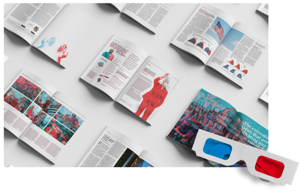
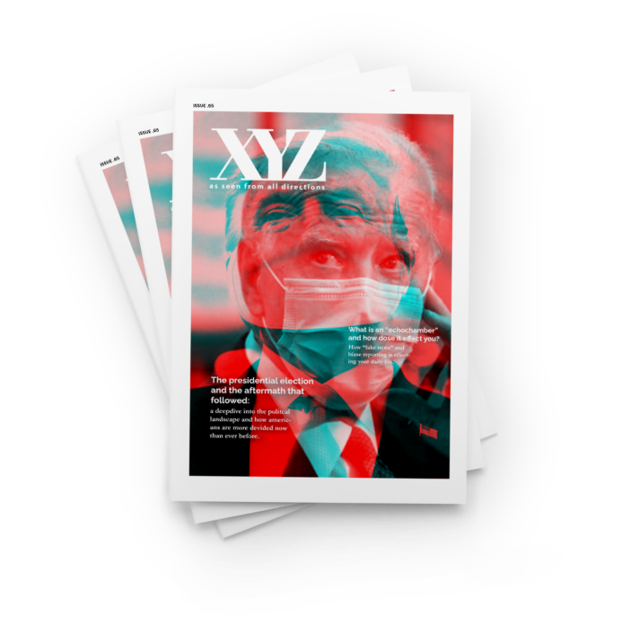
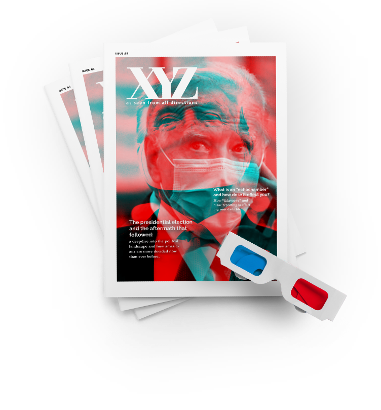
Polarized View
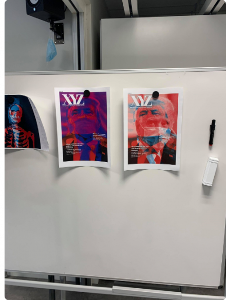
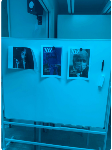
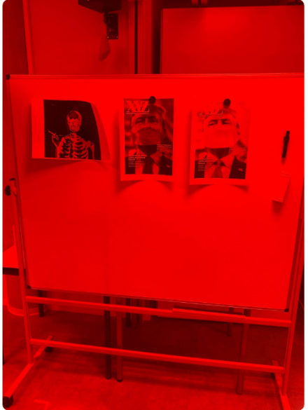
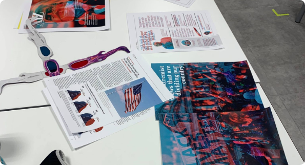
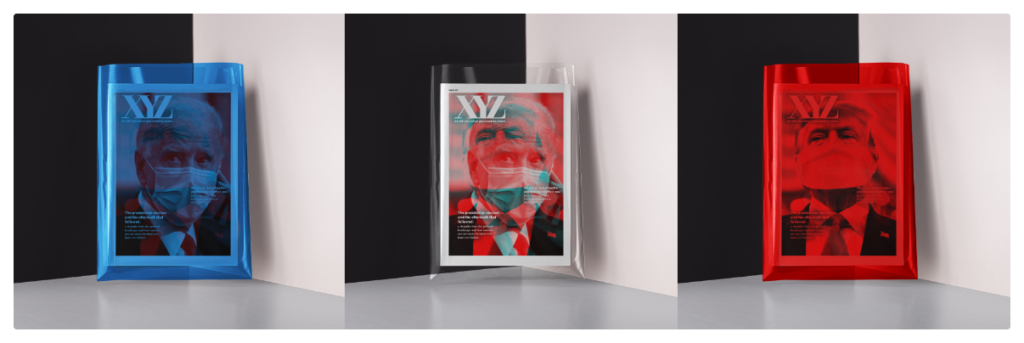
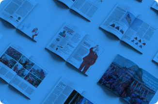
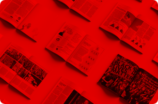
The concept for this project was polarization in the United States political climate. To visualize this concept, I used old analog 3D glasses to symbolize the echo chamber effect that most Americans find themselves experiencing. An echo chamber is simply put an environment in which a person encounters only beliefs or opinions that coincide with their own, so that their existing views are reinforced, and alternative ideas are not considered. This is extremely prevalent in the US and is one of the biggest reasons to the polarization of the American public, by wearing glasses with both red or blue lenses the reader only sees one side of the story, even though it is all right in front of them.
The Name
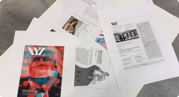
The name for the magazine was a challenge to come up with. It needed to convey a message of neutrality as well as being appealing to all ages. The name XYZ has two underlying meanings, the first of which referencing all three access that make up three-dimensional space. This was an homage to the analog glasses as well as referring to that a story has more than one side to it. The second meaning of the name refers to the readers, also known as the X, Y and Z generations.
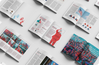
The Magazine
For the actual magazine design and layout, I drew a lot of inspiration from Time Magazine and other American magazines as they have a somewhat unique editorial style. I printed and tested all the pages to make sure that they worked with the color lenses and had the same effect on print as on paper. The effect was slightly less dramatic on print than on paper, however, was still clear enough to be legible and convey the concept and message of the magazine.
Hello!
Let's connect
I hope you like what you see so far! Maybe you have some questions for me or perhaps would like to hire me for a project or bid? In any case feel free to contact me and I am sure we can figure it out!
Made in Oslo 2021 © aksic.no
Privacy Policy
XYZ – Editorial Design
As seen from all angles
Project Brief
In this assignment I needed to put myself in the role of an art director as well as a graphic designer, where I needed to develop a strategy and design concept for a new magazine. The magazine had a minimum requirement of 24 pages.
Polarized View
The concept for this project was polarization in the united states political climate. To visualise this concept, I used tinted glasses to symbolize the echo chamber effect that most Americans find themselves experiencing. Polarization is extremely prevalent in the US and is one of the biggest reasons to distrust and turmoil in the American Public. By wearing the glasses with both red or blue tinted lenses the reader only sees one side of the story, giving them a clear picture of how the echo chamber effect is skewing their perception of reality.
The Name
The name for the Magazine was a challenge to come up with. It needed to convey a Message of neutrality as well as being appealing to all ages. The name XYZ has two underlying meanings, the first of which referencing all three access that make up three-dimensional space. This was an homage to the analog glasses as well as referring to that a story has more than one side to it. The second meaning of the name refers to the readers, also known as the X, Y and Z generations.
The Magazine
For the actual magazine design and layout, I drew a lot of inspiration from Time magazine and other American magazines as they have a somewhat unique editorial style. I printed and tested all the pages to make sure that they worked with the colour lenses and had the same effect on print as on paper. The effect was slightly less dramatic on print than on paper, however, was still clear enough to be legible and convey the concept and message of the magazine.