
Brand Identity - YoungFish
A network for young people in the seafood industry
Project name
YoungFish
Type of work
Brand Identity /
School Project
Duration
16.10.2020 – 30.10.2020
Grade
A
Role
Project Manger / Designer
Brief
Throughout this project me and my group will develop a visual identity proposal for Youngfish, and compete to win the project – the chosen winner will then create the complete identity. The project does not have to be «pixel perfect» or completely finished, but must have all the elements needed to convince the client to choose our idea and concept over the others. We were told to emphasize the insight phase, idea development phase and presentation. As well as the clients brief and their goals.
Problem
The organization has acquired a reputation of being corporate and exclusive, thereby making many members and potential members in the seafood industry hesitant to join and be a part of the organization.
Goals
How to make a new logo and identity for YoungFish that is perceived as less corporate and more inclusive to the workers in the seafood industry?
My Role
In this assignment my role was being the project manager as well as the designer. In addition to helping with the creative process, I had the important role of organizing the team, keeping members accountable for deliverables and making sure that we stayed on track to meet the deadline. The presentation of the project was also my responsibility.


Understanding
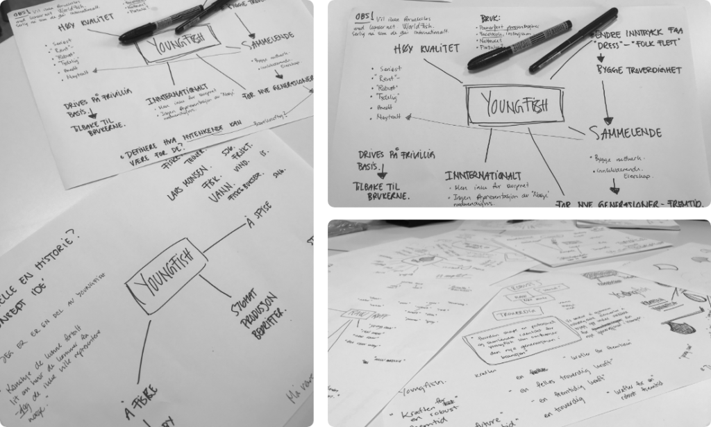
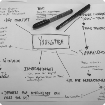
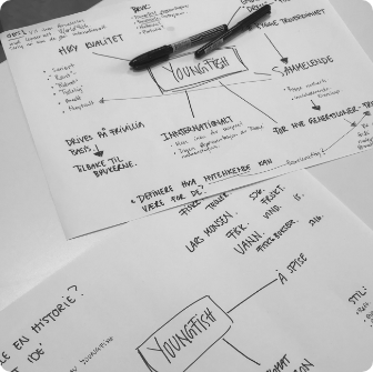
The client brief was short and open. They came in and told us about the organization and said they wanted a new logo because the original logo was old and “not that good”. We therefor needed to ask the client the important questions such as: Why change it? What do you want to achieve by doing this? What do you like about the logo you have? What do you think would make it better?

The Concept
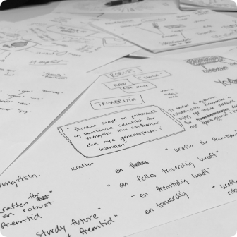
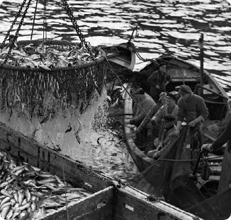
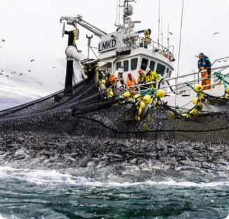
The seafood industry is filed with tradition and even a sense of heritage. We wanted to take care of these values and show that the organization does not want to move away from that, but rather take care of it and expose more young professionals to these values and the industry. YoungFish wants to help young professionals build a network so that the industry can grow, and traditions can be passed on. Because the young fish of today will be the leaders of tomorrow. We therefore made a concept that builds on these ideals of heritage, growth and possibility.

The Logo
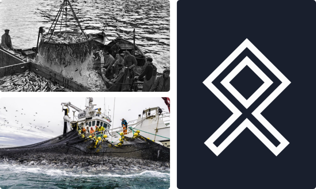
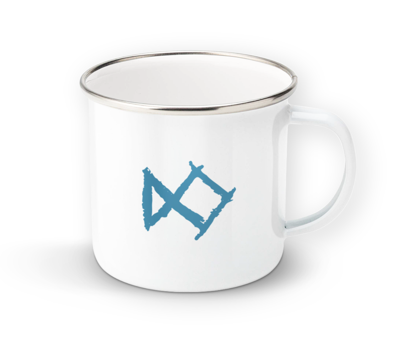
While researching the history of the seafood industry in Norway, I went all
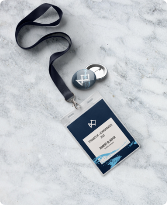
the way back to the Viking age and discovered the Othala rune. The Othala Rune represents something that is innate, natural, or handed down. It refers to a particular kind of wealth that belongs to the familial spring, or something that is inherited. After sharing my discovery with the group,
one of the members mentioned that the rune looked like a vertical fish,
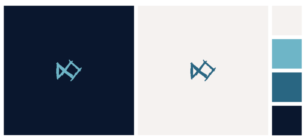
and from there the logo idea was born. A rune like fish that represents heritage, growth and posibility.

The Waves
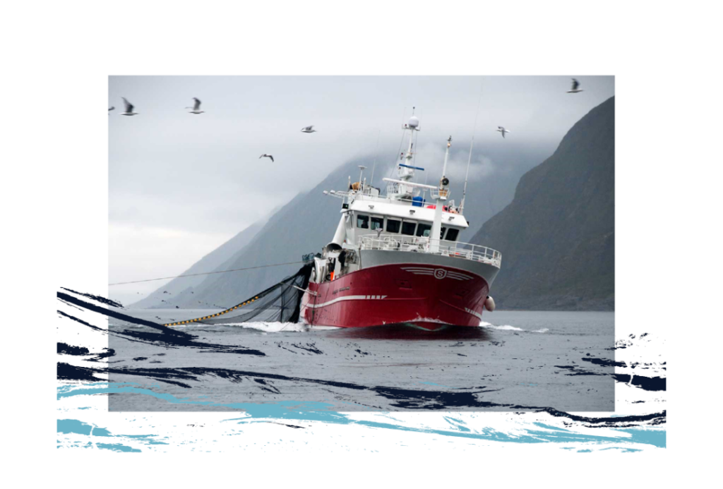
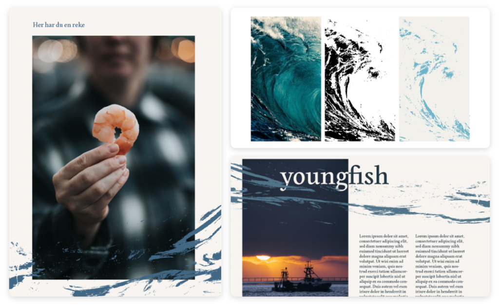
To further convey the nautical theme that is so closely related to the seafood industry we used the ocean and waves both for the color pallet and the pattern. The pattern, color-pallet, photo style and logo all carry a clear nautical theme that when combined makes for a multitude of possible layout combinations and designs.

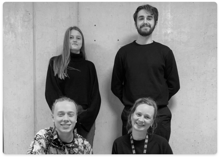

I want to thank my team, Jessica Levin, Michael Juliussen and Kartine Amdal for the time and effort that was put into this project. It was a team effort and they were a pleasure to work with.
Hello!
Let's connect
I hope you like what you see so far! Maybe you have some questions, feedback or inquiries? In any case feel free to contact me!
Made in Oslo 2021 © aksic.no
Privacy Policy

YoungFish – Brand Identity
A network for young people in the seafood industry
Project Brief
Trough this project me and my group will develop a visual Identity proposals for Youngfish, and compete to win the project – the chossen winner will then create the finished identity.
The project should not to be «pixel perfect» or completely finished, but must have all the elements needed to convince the client to choose our idea and concept over the others. We were told to emphasize the insight phase, idea development phase and presentation. As well as the clients brief and their goals.


Understanding
The client brief was short and open. They came inn and told us about the organization and said they wanted a new logo because the original logo was old and “not that good”. We therefor needed to ask the client the important questions such as: Why change it? What do you want to achieve by doing this? What do you like about the logo you have? etc.



The concept
The seafood industry is filed with tradition and even a sense of heritage. We wanted to take care of these values and show that the organization dose not want to move away from that, but rather take care of it and expose more young professionals to these values and the industry. YoungFish wants to help young professionals build a network so that the industry can grow, and traditions can be passed on. Because the young fish of today will be the leaders of tomorro, we made a concept that builds on these ideals of heritage, growth and posibility.



The logo
While researching the history of the seafood industry in Norway, I went all the way back to the Viking age and discovered the Othala rune. The Othala Rune represents something that is innate, natural, or handed down. It refers to a particular kind of wealth that belongs to the familial spring, or something that is inherited. After sharing my discovery with the group, one of the members mentioned that the rune looked like a vertical fish, and from there the logo idea was born. A rune like fish that represents heritage, growth and posibility.
