Brand Identity - Musikaliteten
Brand Identity for a musikktheaterfestival
Project name
Musikaliteten
Type of work
School project/Brand Identity
Duration
17.08.2020 – 11.09.2020
Grade
A
Role
Graphic Designer
Brief
Through this school project, you will develop a dynamic identity for the Music Theater Academy’s annual festival «Musikaliteten» with accompanying design manual that ensures that the identity appears holistic, recognizable, and easy to use. Emphasis the customer’s brief and target group (s) in the assignment.
Problem
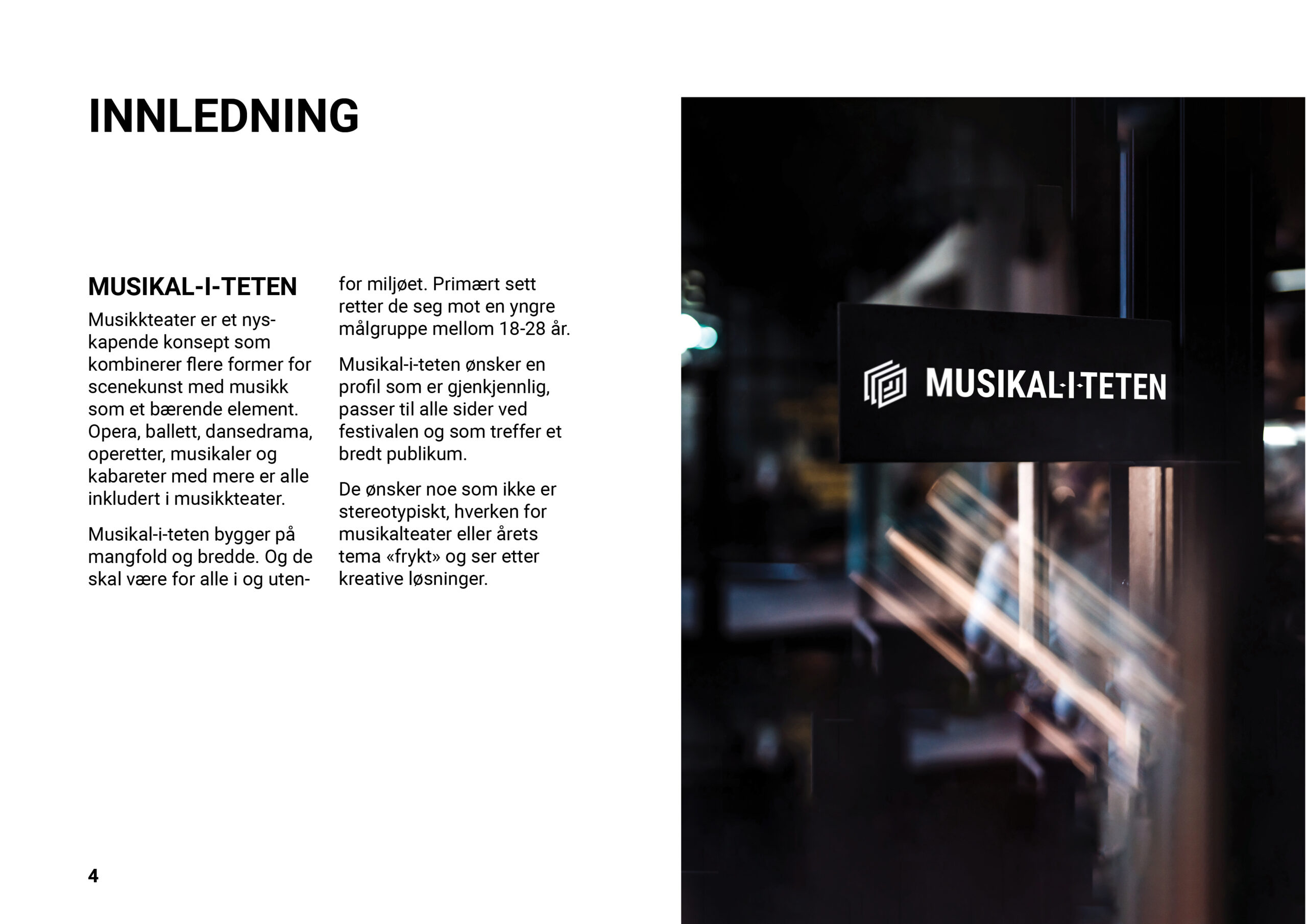
The customer wanted to reach out to a wider demographic, specifically young students in Oslo, Norway. In addition, they need a new brand identity and a visual representation of their theme for the festival which for this case is “fear”.
Goals
Create a brand identity for “Musikaliteten” that encompasses the people from the Music Theater Academy and musical theater in a way that is appealing to the target demographic. In addition, create a visual representation for the festival theme “fear” that is not stereotypical.
My Role
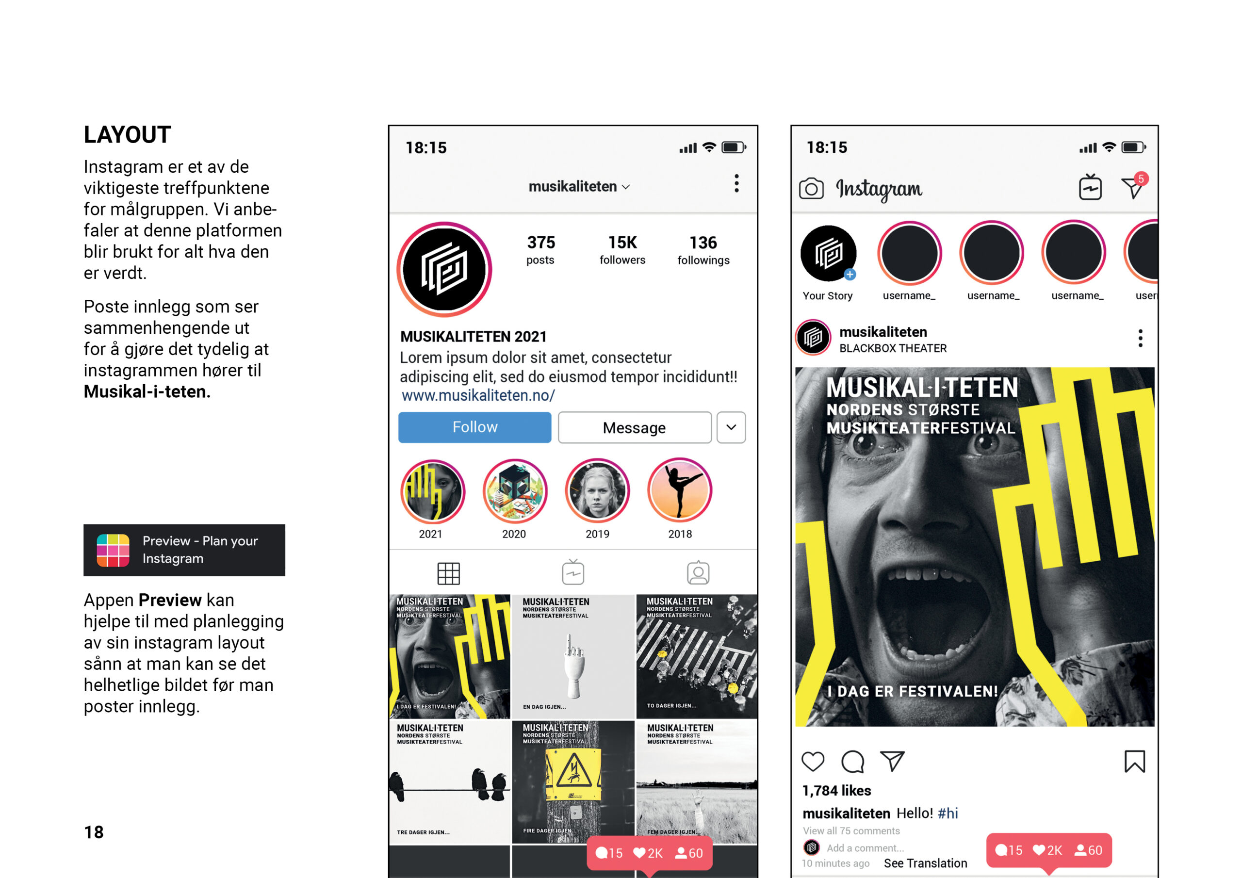
This assignment was a group project. At the start of the project the rest of the team and I were all equally involved in research and experimentation of brand identity and concept visualization. Later on my main responsibilities were social media, creation of logos and mock-ups, roll-up design, silk printing and all production of printed material. In addition, I made an Instagram filter that was authenticated and is available for use in the app, as well as being solely responsible for the client pitch and presentation..
The Norwegian Collage for Musical Theater
The client for the project was The Norwegian Collage for Musical Theater, which is a school for those who have a passion for musical theater and wish to pursue a career in the field. Those that attend the school will receive a versatile and professional musical theater education with broad knowledge within the musical theater subject. During the brief the client said “musical theater is much more than just what you might think”. What the client refers to here is the myth that musical theater is simply the same as just musicals.
However, musical theater is more than just musicals and includes everything from opera and ballet to cabaret and dance drama.
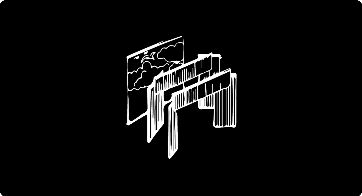
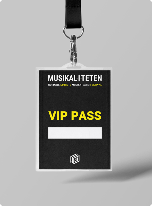
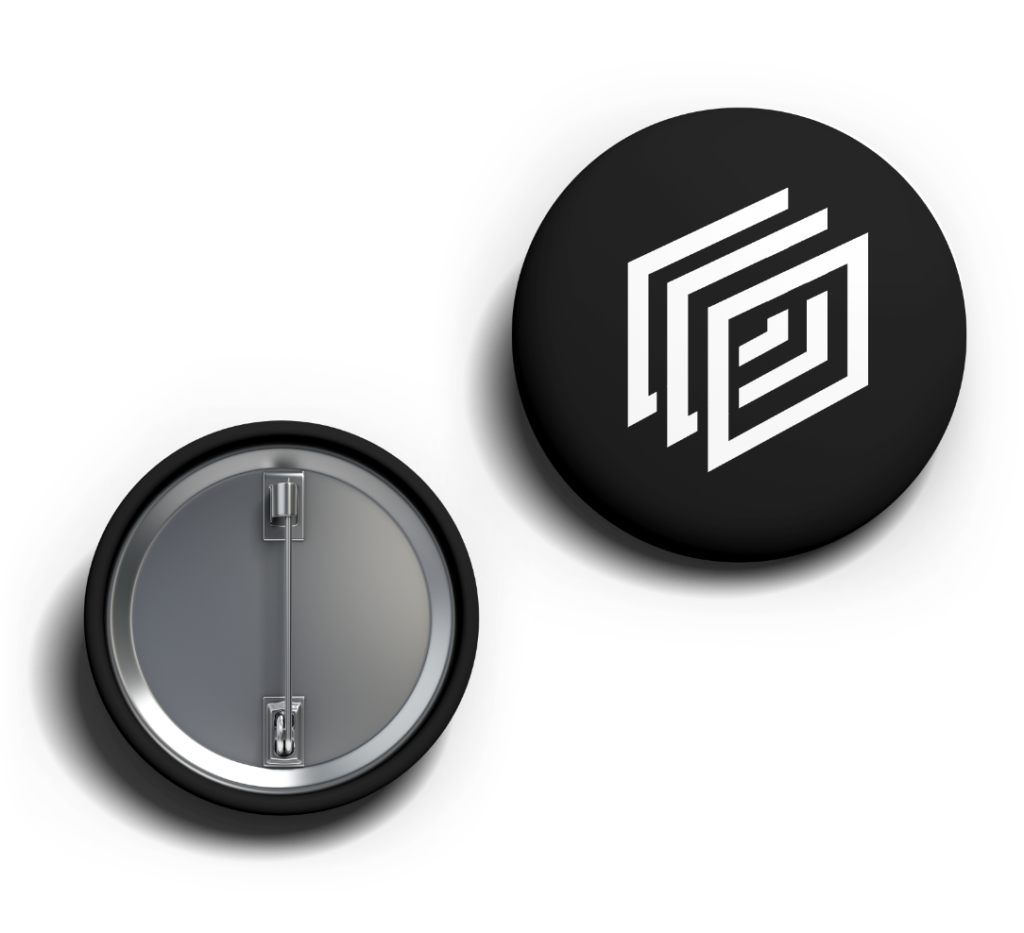
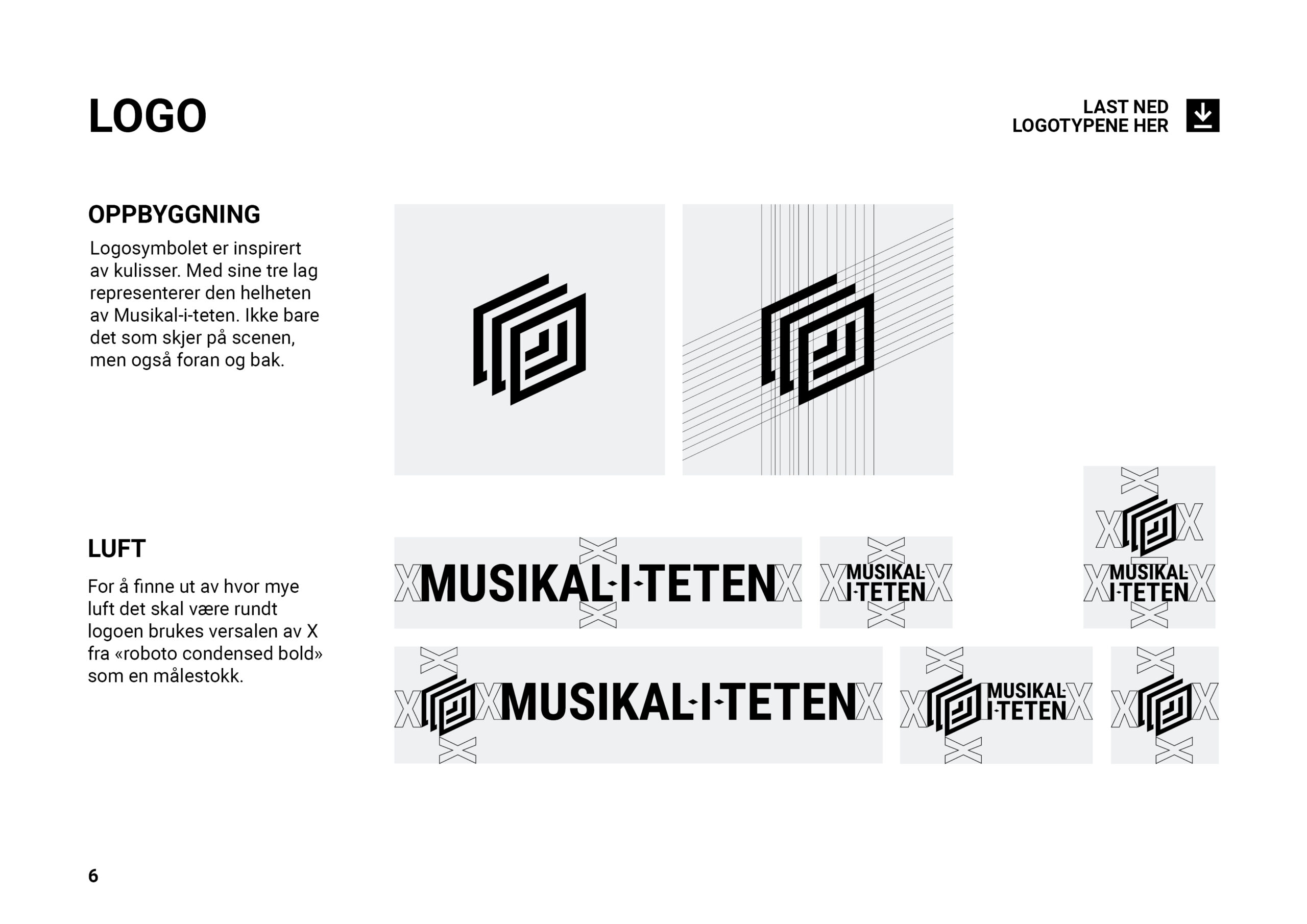
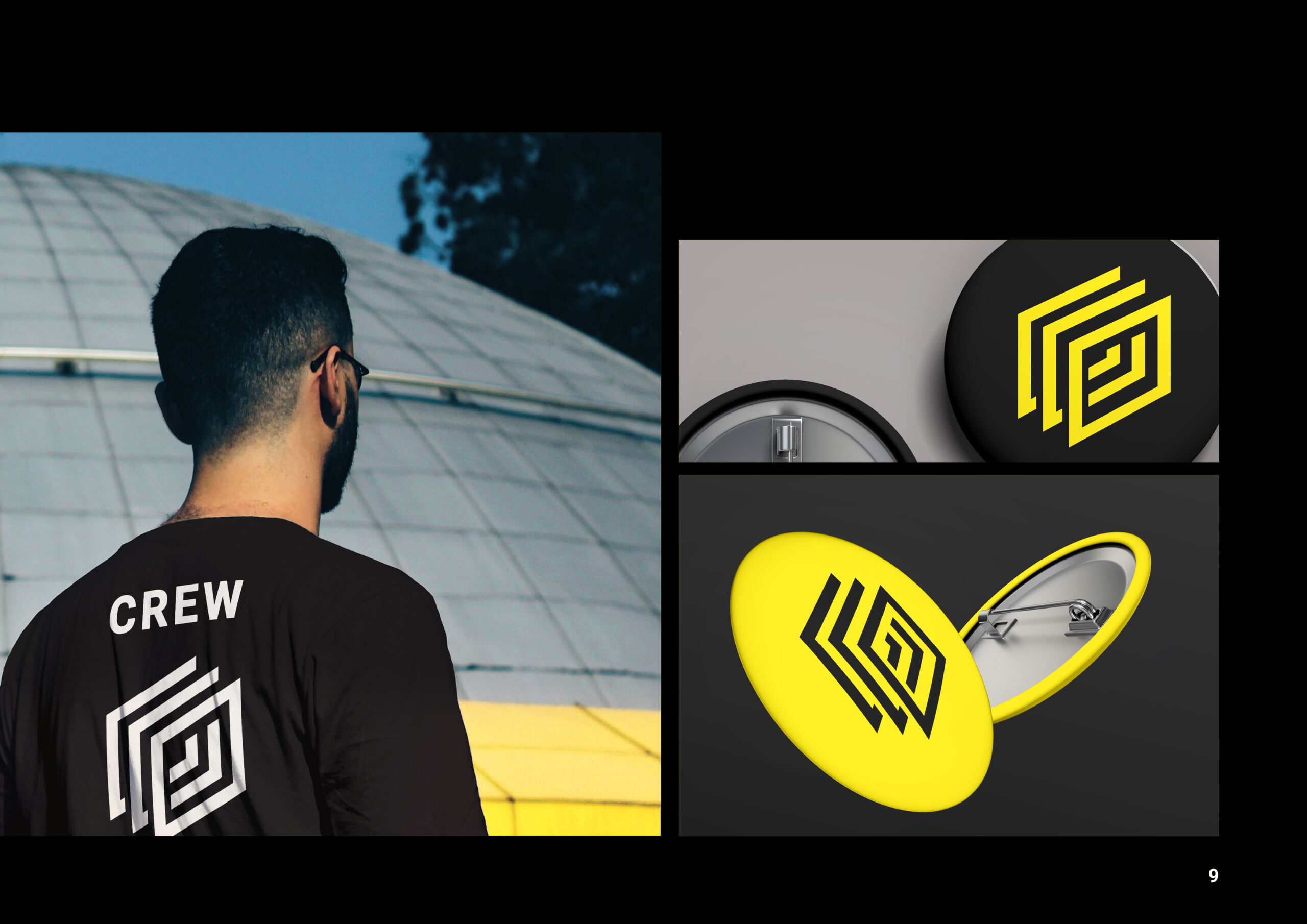
For the task of creating a brand identity for the annual musical theatre festival, I came up with the idea of using a simplified version of the stage layers as the logo mark. The three layers of the stage are also symbolic in that they represent the three groups involved in any performance. The first layer is the audience, without them there would be no show. The second or middle layer is the performers, creating wonders for the audience to enjoy. And lastly, we have the crew and technicians, quietly working behind the scenes to make sure that the audience and performers have a good experience.
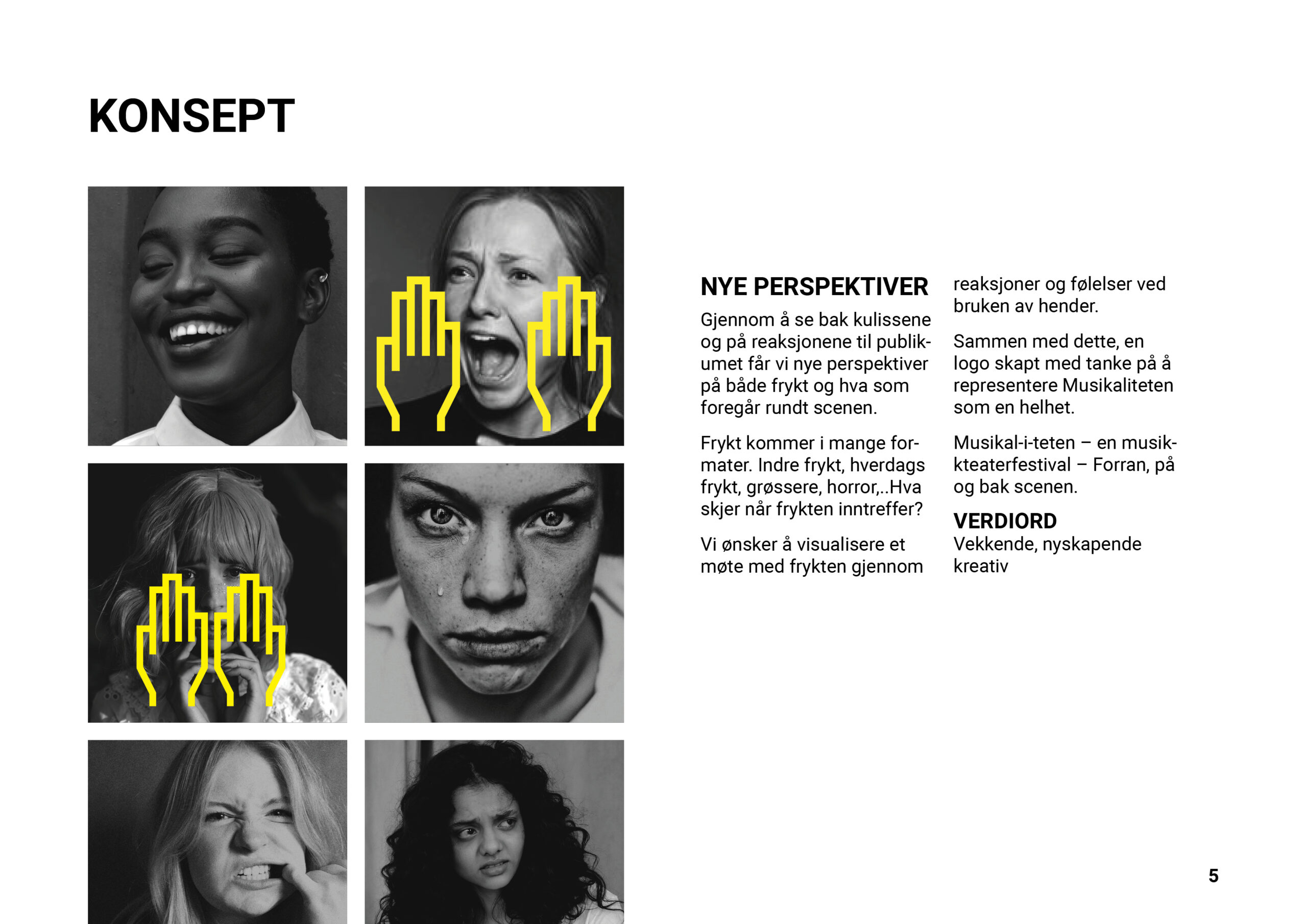
Fear Not Horror
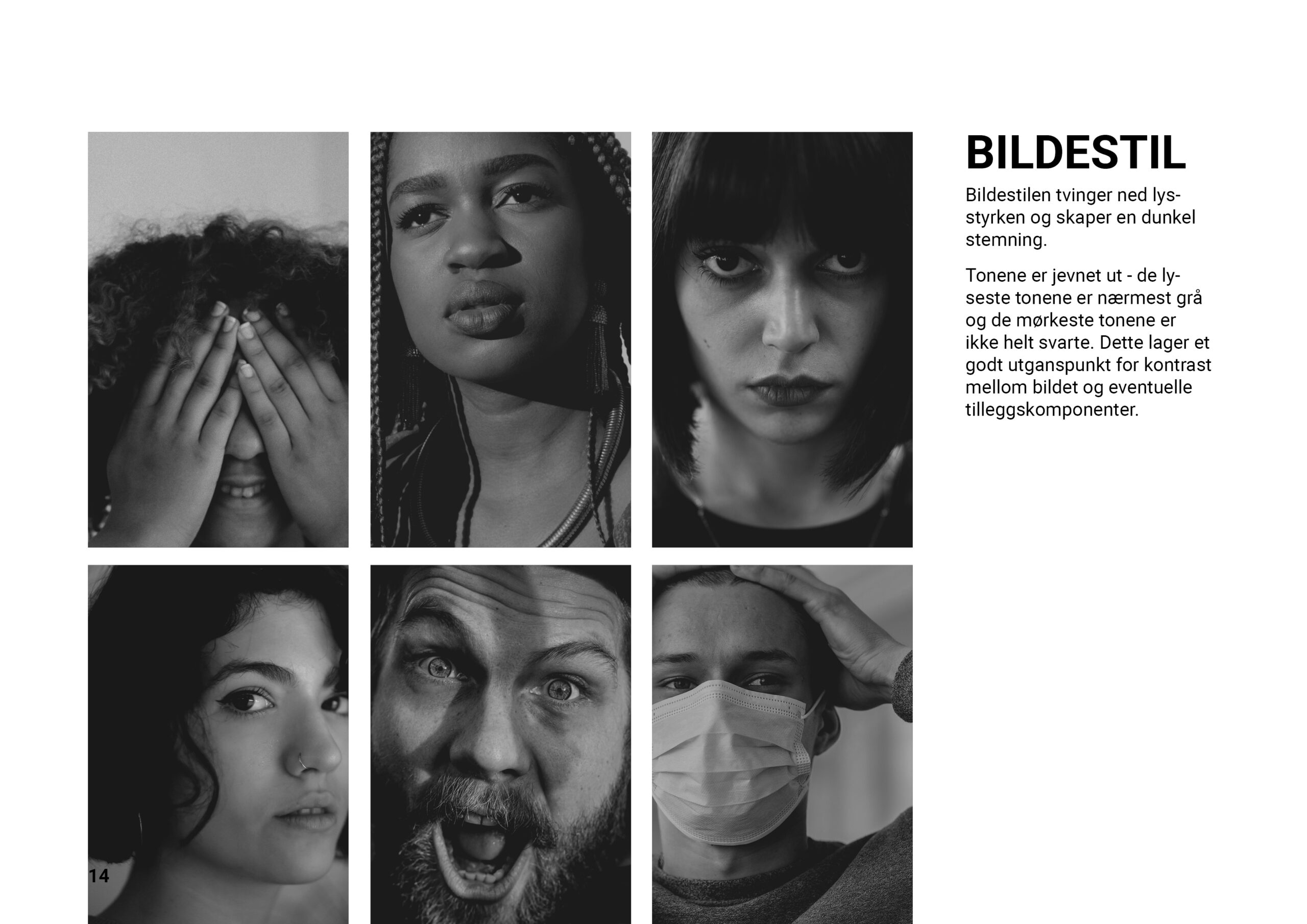
When it came to the concept the client was clear that they wanted the concept to be fear and not horror. They stated that fear can be light and even funny, while horror cannot. In addition, they did not want any stereotypical depictions of fear, but rather something new. To try and create a concept around all the client’s wishes was difficult. However, we felt we were able to create something that was just what they wanted. By changing our perspective from looking at fear, to looking at the response
to fear we came up with our concept.
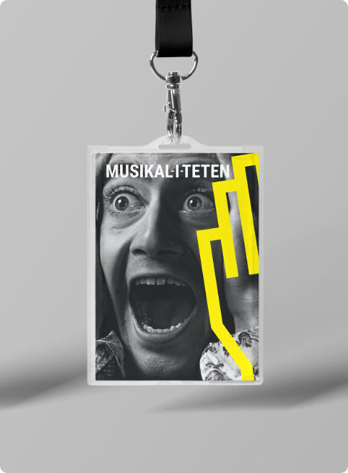
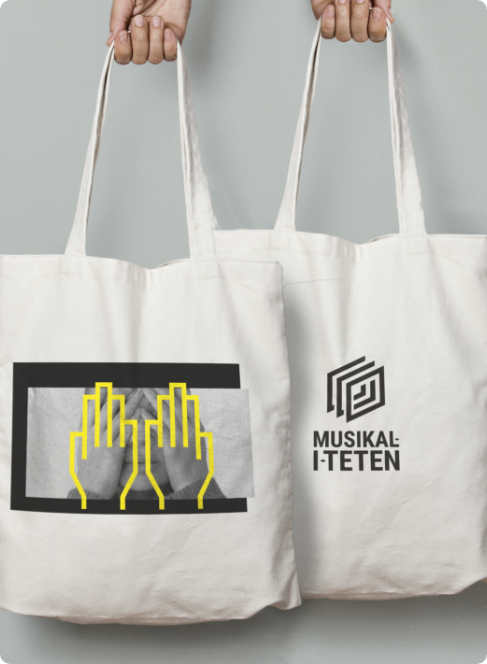
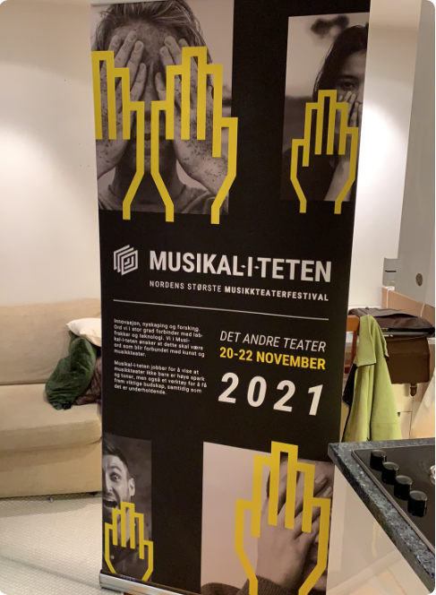
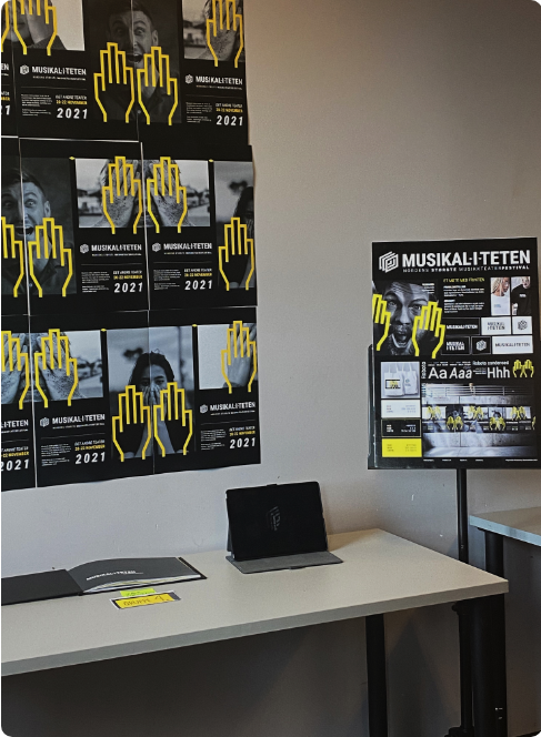
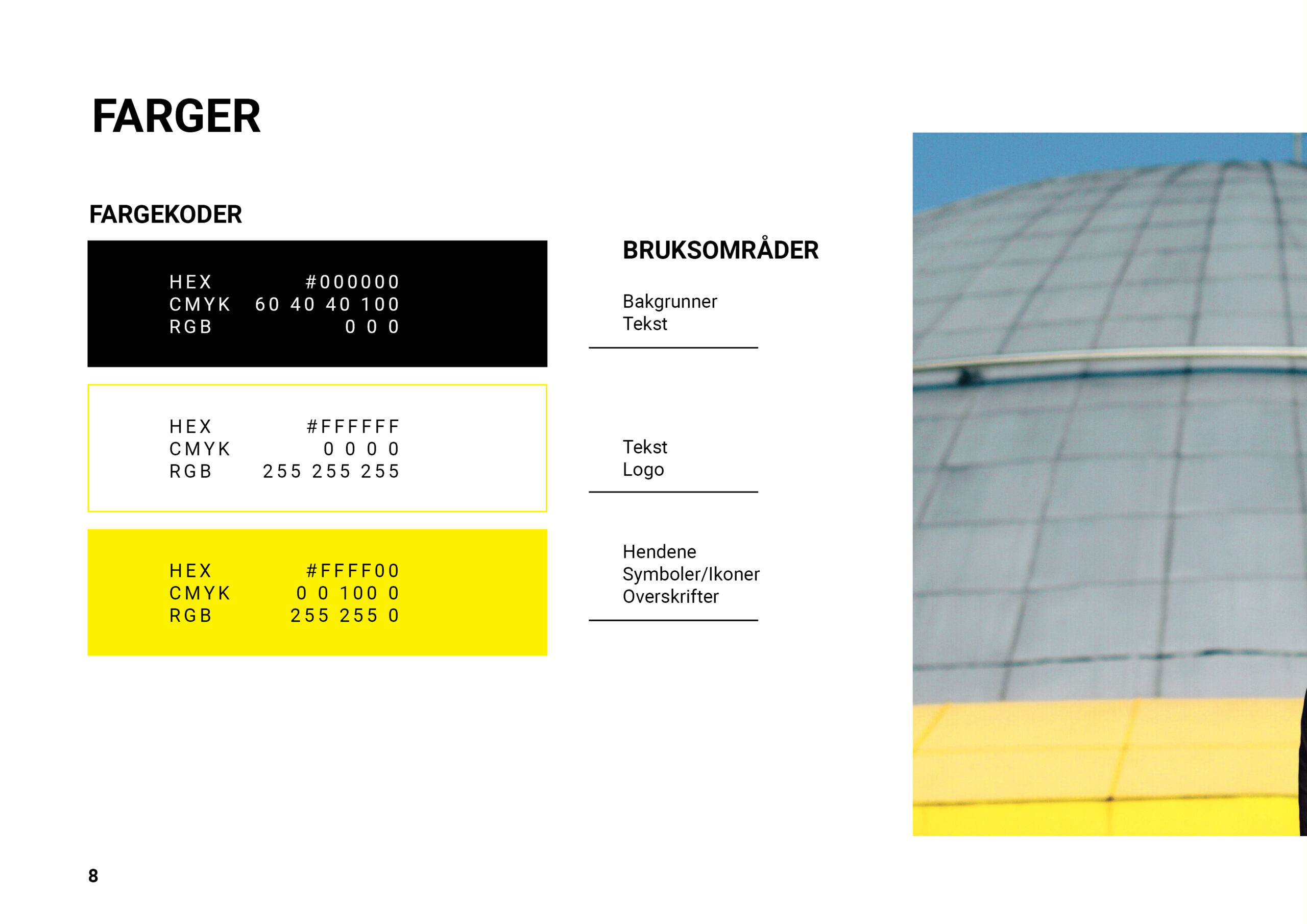
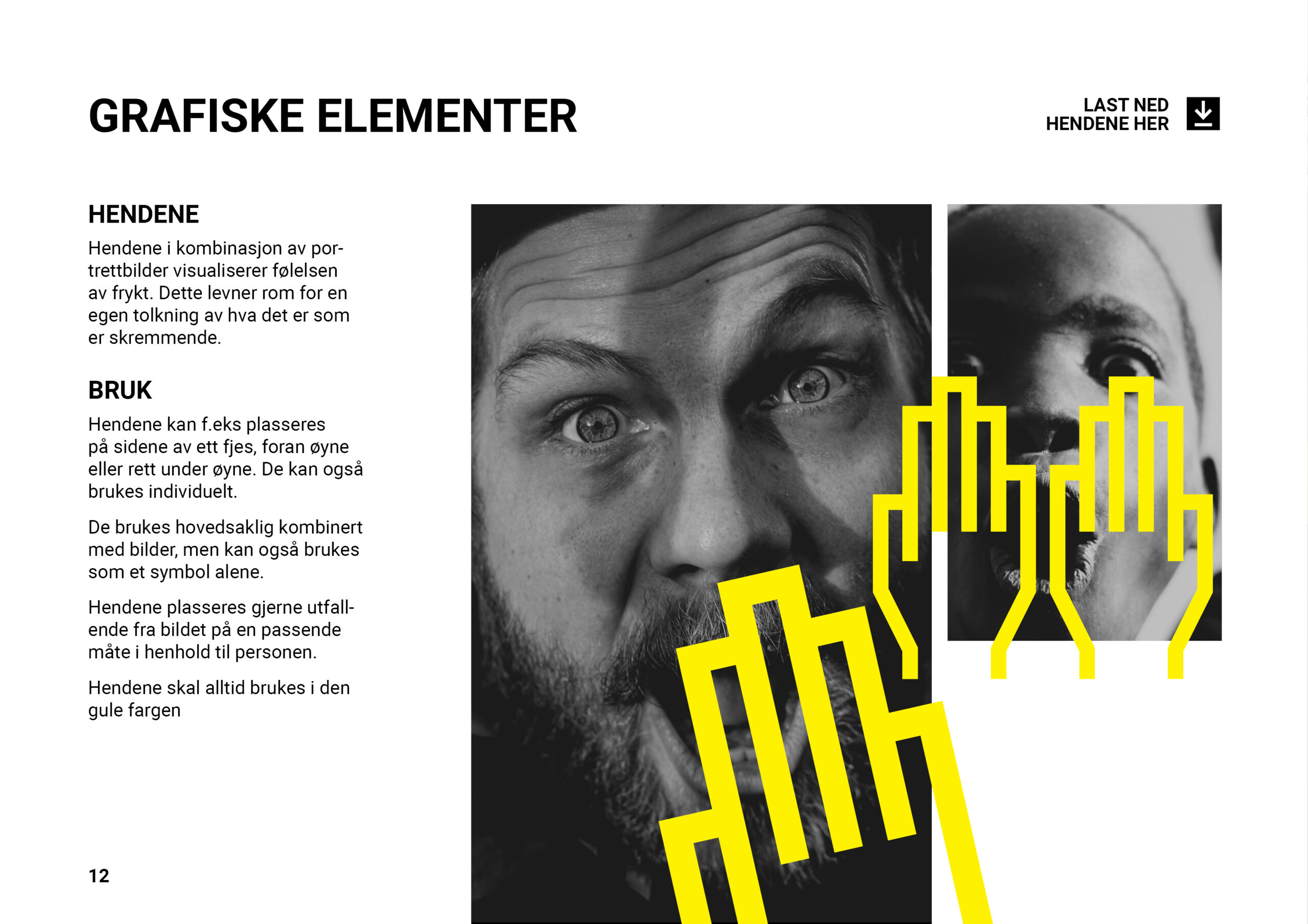
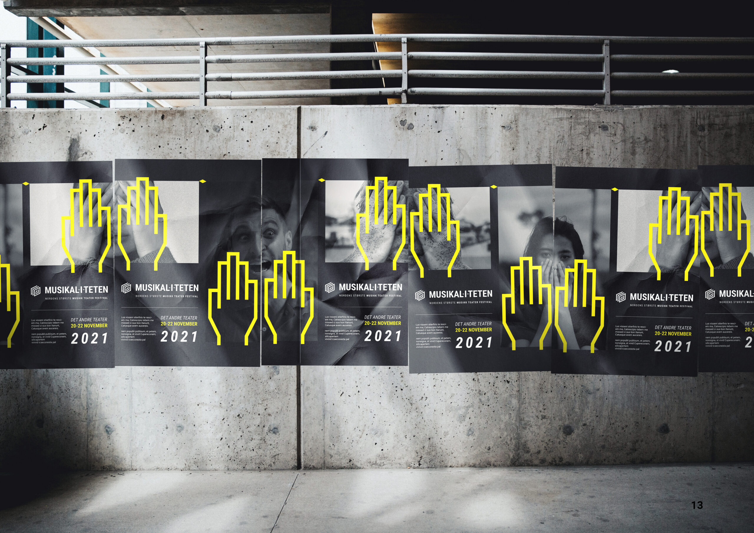
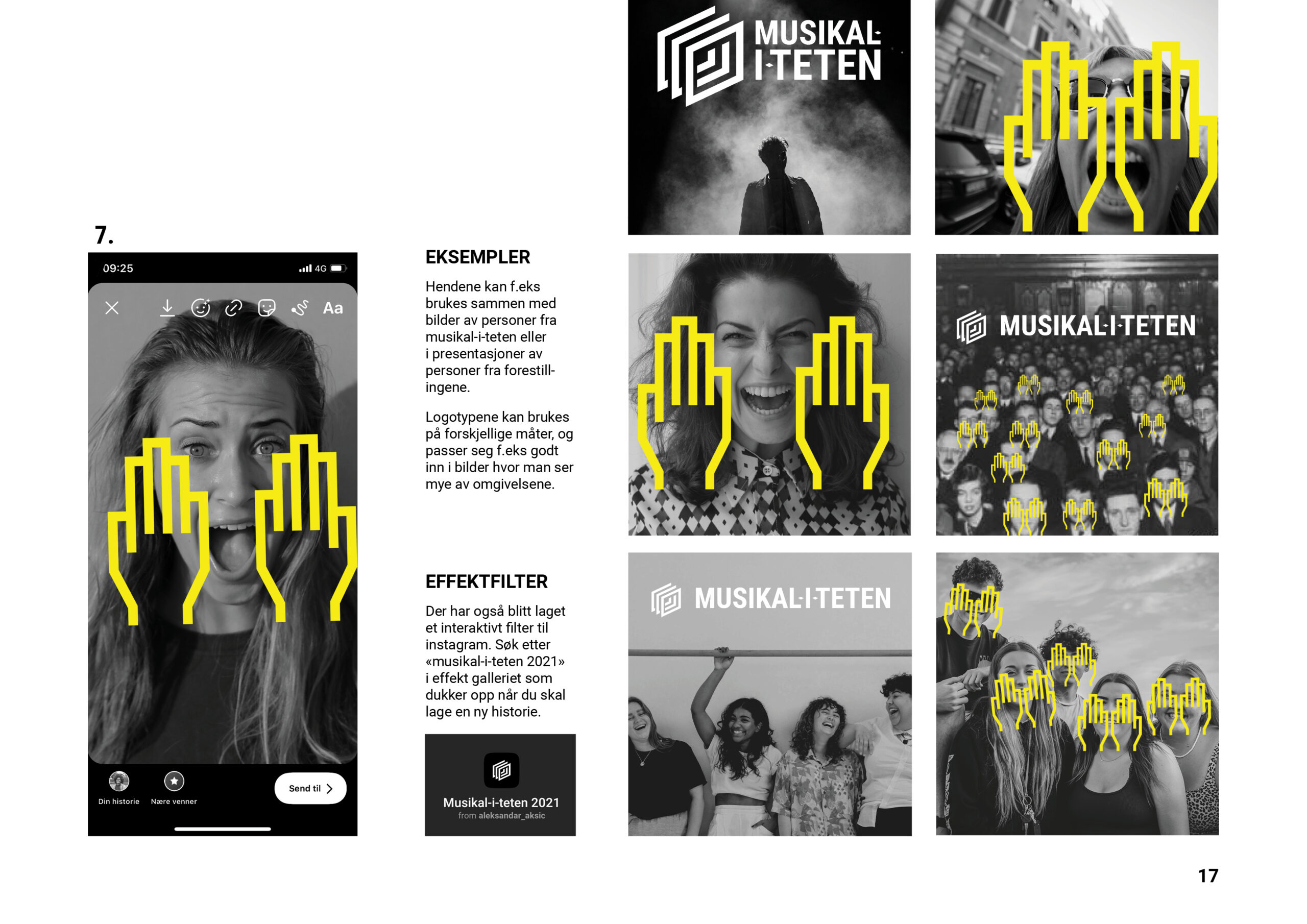
The yellow hands combined with black and white portraits of different expressions became our non-stereotypical depiction of fear. By using people’s reactions to fear instead of fear itself we were able to convey a
clear feeling of fear without it being too scary or off putting. The faces and hands intrigue viewers to be curious, and thereby making them want to know more.


Playing My Part
In this project I wore many hats and worked many hours of overtime. I was mainly responsible for the logo design, social media, mock-up manufacturing, video production, print production, silk printing as well as designing the roll-up. However, the thing I am most proud of is the Instagram filter I made for the festival. I learned a new software called SparkAR and dove headfirst into a whole new world where I had no to little knowledge. Nevertheless, I was successful in creating a functioning Instagram filter that was authorized and available in the app.

I want to thank my team, Jessica Levin, Ferdrik Steen Haugen and Kartine Amdal for the time and effort that was put into this project. It was a team effort and they were a pleasure to work with.
Hello!
Let's connect
I hope you like what you see so far! Maybe you have some questions for me or consider hiring me for a project/collaboration or just to chat? In any case feel free to contact me and I am sure we can figure it out!
Made in Oslo 2021 © aksic.no
Privacy Policy
Musikaliteten – Brand Identity
Booktracking app prototype
Project Brief
Through this School project, me and my team developed a dynamic identity for the Music Theatre Academy’s annual festival «Musikaliteten» with accompanying design manual that ensures that the identity appears holistic, recognizable, and easy to use.
The Norwegian Collage for Musical Theatre
The client for the project was The Norwegian Collage for Musical Theatre, which is a school for those who have a passion for musical theatre and wish to pursue a career in the field. Those that attend the school will receive a versatile and professional musical theatre education with broad knowledge within the musical theatre subject.
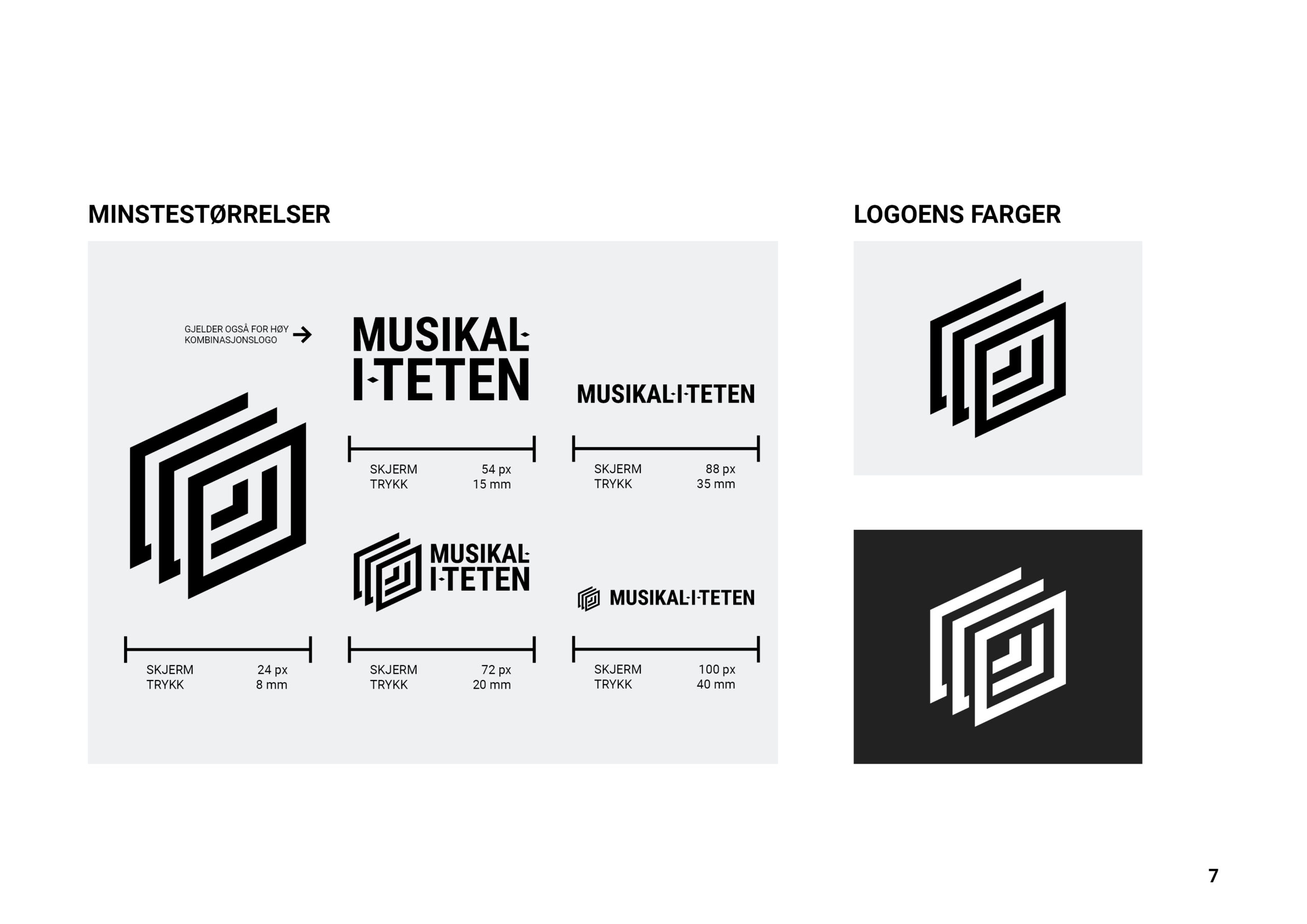
The logo mark
For the task of creating a brand identity for the annual musical theatre festival, I came up with the idea of using a simplified version of the stage layers as the logo mark. The three layers of the stage are also symbolic in that they represent the three groups involved in any performance. Audience, actors and back stage technicians.
Fear Not Horror
During the briefing the client was very clear about the concept for this years festival would be fear and not horror. They said that fear should also be able to be funny and light, and not only scary. We felt we were able to create something that was just what they wanted, buy changing our perspective from looking at fear to looking at the response to fear.

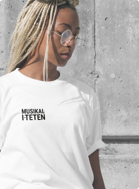
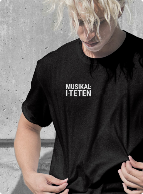
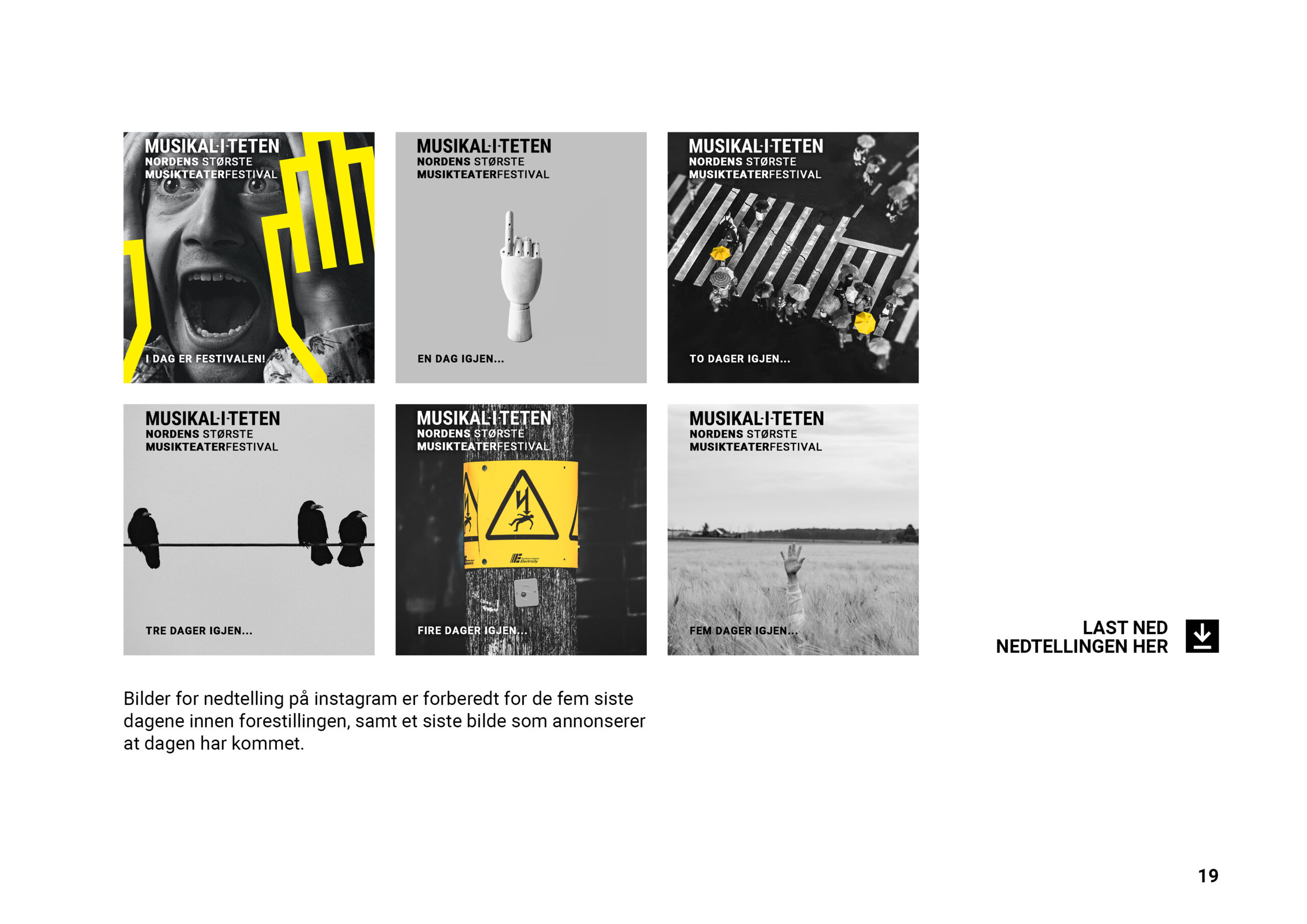
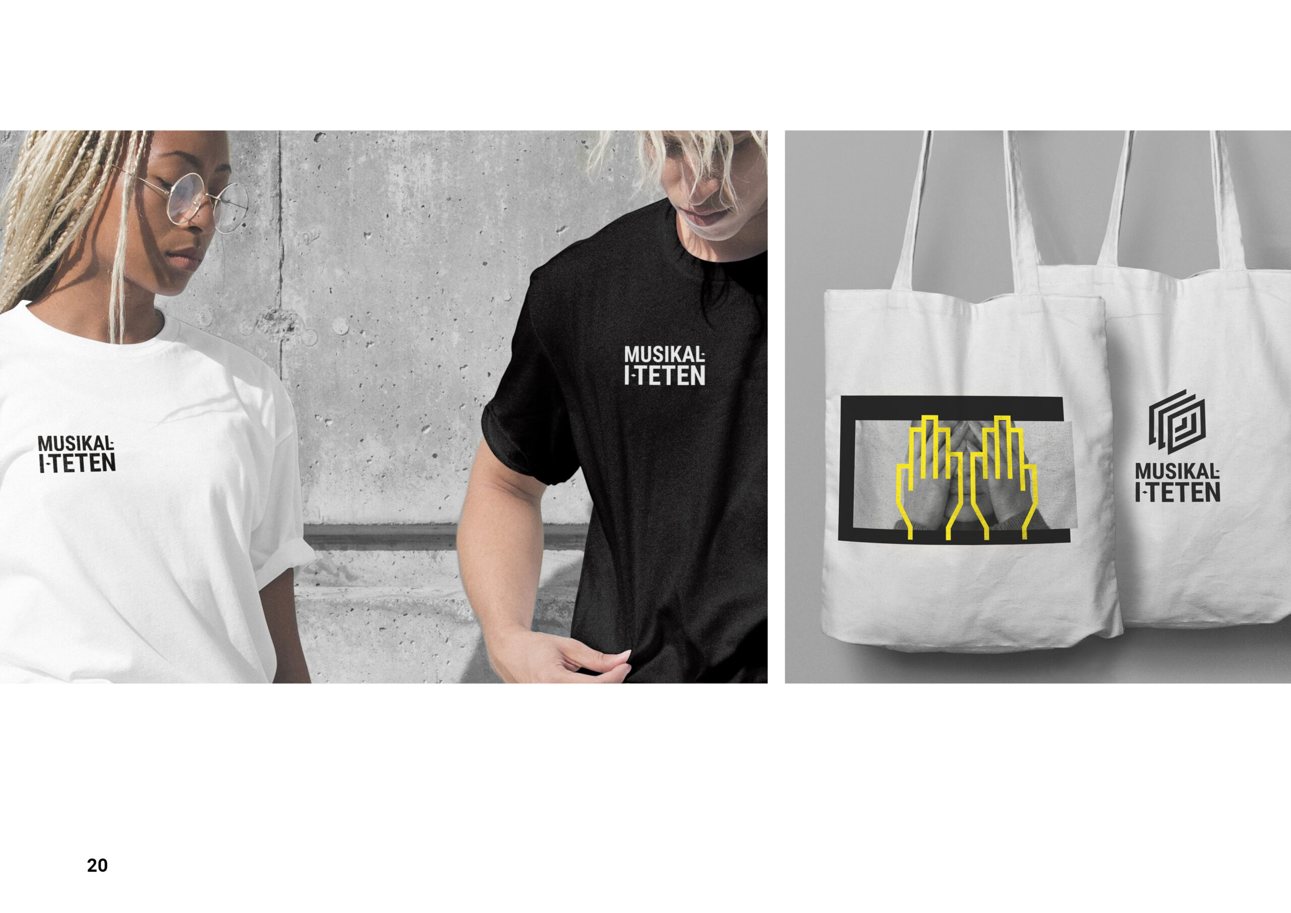
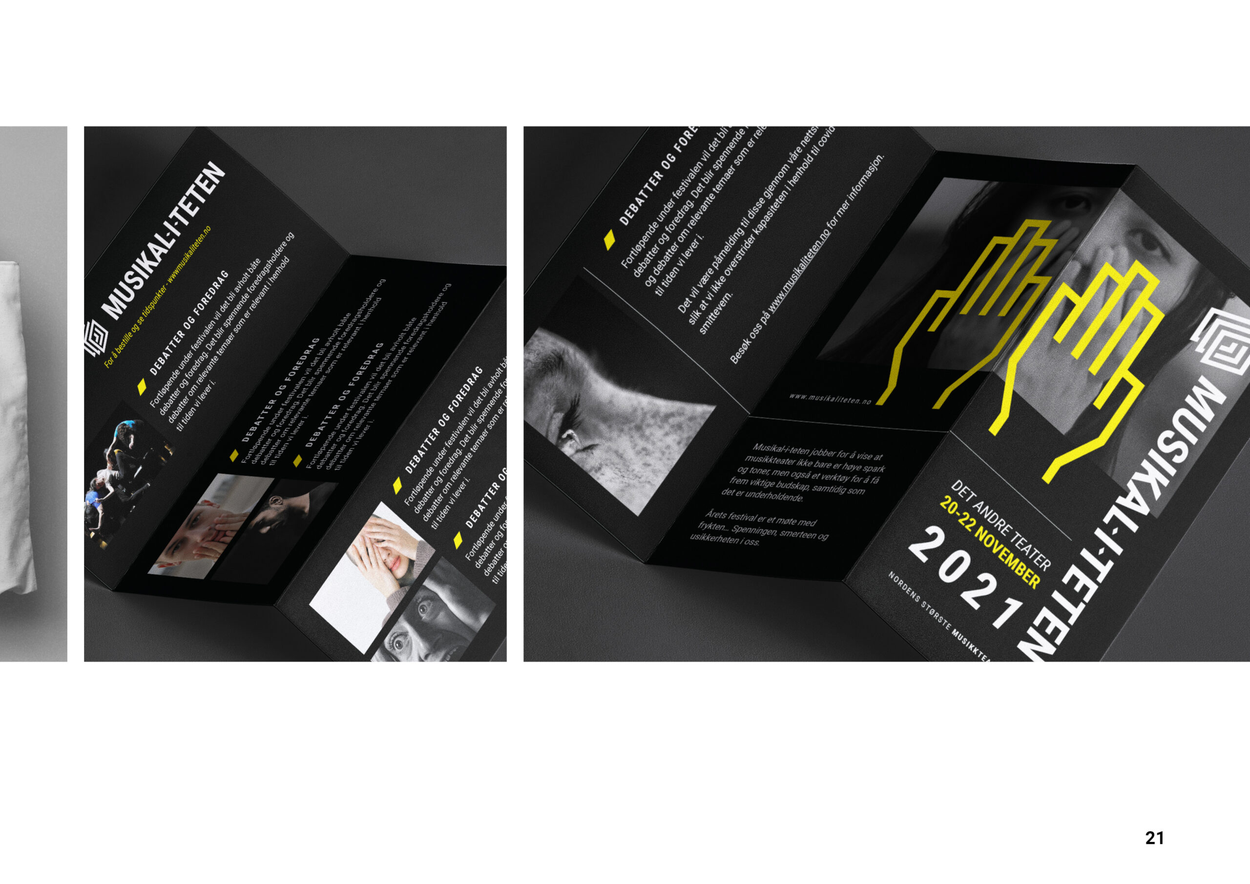
Finished Products